Note: First, I haven't quite mastered the Mac world yet and haven't figured out how to get the album covers to work. Secondly, I found out while trying to come up with bad album covers that generally I either liked them, or they were so standard that I had no real dislike of them. I googled worst album covers and that just brought up a bunch of albums and artists from the 60s and 70s that I had never heard of. So for the most part I picked out albums from my collection that I liked the least.
10. Just Push Play - Aerosmith
Never was wild about the pink background and Robot chick. They were trying to be a little brave with this one and I don't think it worked. I think Aerosmith like Van Halen could pop their logo on the front of every album and be okay.
9. 15 - Buckcherry
I like this album and see that these hardrockers have a new one out that I might want to give a listen too. But the cover with a close up of a dirty finger getting pricked by a needle and blood pouring out is just a little too blunt for me.
8. Silver Side Up - Nickelback
This has a big green eye on the front crying silver tears. I think it'd be a great cover for some Sci-Fi or Fantasy book, but I don't get how any of it including the album title fits with the music.
7. Magical Mystery Tour - The Beatles
This album spawned a couple of my favorite Beatles tunes like Penny Lane and Your Mother Should Know, but the whole concept is a little too drugged out for me. The guys in costumes in front is bizarre and all the color is a little over the top.
6. Blood, Sugar, Sex, Magik - The Red Hot Chili Peppers
This album put the Peppers on the global market, but I never got into the cover art. It has the four members faces acting as a frame for the album with their tongues sort interlocking. Just not my thing I guess.
5. Some Girls - The Rolling Stones
This has the four guys in different woman's wigs on the front and is made out to look like some kind of newspaper ad with the four colors in the background. The other thing about this album is that you can' find the song list on the outside anywhere. I hate when bands do that.
4. Pet Sounds - The Beach Boys
This is the paramount album from probably one of the top five bands of the 60s and you have them playing with some goats on the front? I think this really hurt the album as much as the Beatles releasing Sgt. Peppers at the same time. It really made the Beach Boys look like yesterday's band and the Beatles tomorrows.
3. In the Dark - The Grateful Dead
Upside down faces on a black backdrop. I get the reference for the title, but don't we all expect a little more creative from the band that made Tie Dye popular. At least gets us a skull or two in there somewhere. I mean they're the Dead. Let's play that up a little more.
2. Blind Faith - Blind Faith
Usually I am all for female nudity, but come on the girl on this cover is like 11 years old. These guys were all in their 30s and 40s by the time this came out. Anyone else think this is a little weird. They couldn't even make this album cover today. They'd be put in jail for it. I don't see the point or the art in it.
1. Captain Fantastic and the Brown Dirt Cowboy - Elton John
Okay it took people how long to figure out Elton John was gay. Look back at this cover of a cartoon him straddling a piano and tell me you didn't suspect something then. Plus, my god like at the title of this thing. All together it's really campy, which was sort of John's thing, but a little too much so here.
Showing posts with label worst album cover art. Show all posts
Showing posts with label worst album cover art. Show all posts
Monday, October 6, 2008
Saturday, October 4, 2008
Snakester's Top 10 Bad Album Covers
10. Amorica - Black Crowes:
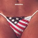 I remember seeing this one in a used CD store and thinking that was pretty bad. Especially then how it had to be censored as a black cover with just the triangle of the flag bikini on the front. Anymore I don't see how that is real offensive or graphic. Stupid and pointless, yeah I can see that!
9. Cosmo's Factory - Creedence Clearwater Revival:
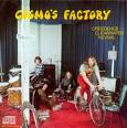 This always cracked me up when I had this on cassette. Yes a real cassette! Is it supposed to be like someone walked in on the guys and took a quick snapshot? This is probably their best album with the most hits. But the cover just doesn't make any sense.
8. Get A Grip - Aerosmith:
 So are we supposed to get a grip on a cow teet? Branding a cow with the Aerosmith logo would be cool but a cow with a pierced nipple is strange. I can imagine the long nights they stayed up trying to think up something get for this kick ass album. Hmm I have pierced nipples, why couldn't a cow did it?! Come on! Get a grip!
7. Get Yer Ya-Ya's Out - The Rolling Stones:
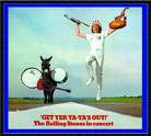
For being so expressionless in any concert footage I have ever seen of the Rolling Stones, Charlies Watts seems way too overjoyed to be walking down a road with a donkey. The donkey doesn't seem as impressed. For their first big live album release, they could have represented this moment much better. Instead, they made themselves look like asses.
6. Houses of the Holy - Led Zeppelin:
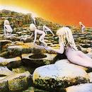
Led Zeppelin has some of the coolest album art ever. I just never understood this one. I had to do some research to find out that it is inspired by the ending of Arthur C Clarke's novel Childhood's End. I still don't see how that ties into the album at all. Although I think at this stage, maybe they were looking for more shock value on their covers to sorta give the middle finger to the industry. I don't get it but it is still my favorite LZ album.
5. Kiss Alive - Kiss:
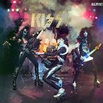 This is supposed to represent the spectacle that was their live shows. It just looks extremely staged. They could have tried a little harder to get a real concert shot from one of their shows. I know Kiss is over the top but they aren't exactly fake. This shot makes them look fake.
4. Who's Next - The Who:
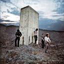 This one seems to get alot of praise. To me it is just a couple of guys pretending to have pissed on a concrete structure. I used to believe them all that this was so cool but really it isn't anything that great. The album is awesome if not underrated. The art way overrated!
3. Magical Mystery Tour - The Beatles:
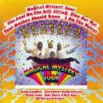 Ok, here is a tough time for me, finding fault in something from the Beatles. But come on, this was isn't anywhere near the level of their other art. It is over the top and corny. This was just another representation of their downward slide after Brian's death. They became unpolished and without discipline. I just have never liked looking at this cover, it isn't The Beatles!
2. 1984 - Van Halen:
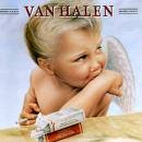 Maybe this was a childhood photo of David Lee Roth? That is probably the only way this makes any sense. Maybe they were trying to show how rebels can be good guys too. I don't know, I am not an art major. This was quite a different direction from their previous cover art. Maybe there is more too it but I never liked it.
1. Metallica (Black Album)- Metallica:
 Ok first it has been done, maybe in a different color but done. Then this particular version reminds most of Spinal Tap. Not a good way to be considered a serious metal band. This marked the beginning of a string of lackluster covers from a dark band previously using alot of symbolism on their covers. I never quite understood the little embossed snake in the corner either.

Breakfast in America - Supertramp:
I wonder if that lady regrets it now?
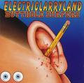
Electriclarryland - Butthole Surfers:
Is it weird that I was always more disturbed by the two eyes sitting on the side of his face?
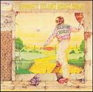
Goodbye Yellow Brick Road - Elton John:
How did anyone not know he was gay?
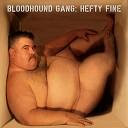
Hefty Fine - Bloodhound Gang:
Nobody wants to see that!
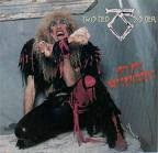
Stay Hungry - Twisted Sister:
I think I lost my appetite.
 I remember seeing this one in a used CD store and thinking that was pretty bad. Especially then how it had to be censored as a black cover with just the triangle of the flag bikini on the front. Anymore I don't see how that is real offensive or graphic. Stupid and pointless, yeah I can see that!
9. Cosmo's Factory - Creedence Clearwater Revival:
 This always cracked me up when I had this on cassette. Yes a real cassette! Is it supposed to be like someone walked in on the guys and took a quick snapshot? This is probably their best album with the most hits. But the cover just doesn't make any sense.
8. Get A Grip - Aerosmith:
 So are we supposed to get a grip on a cow teet? Branding a cow with the Aerosmith logo would be cool but a cow with a pierced nipple is strange. I can imagine the long nights they stayed up trying to think up something get for this kick ass album. Hmm I have pierced nipples, why couldn't a cow did it?! Come on! Get a grip!
7. Get Yer Ya-Ya's Out - The Rolling Stones:

For being so expressionless in any concert footage I have ever seen of the Rolling Stones, Charlies Watts seems way too overjoyed to be walking down a road with a donkey. The donkey doesn't seem as impressed. For their first big live album release, they could have represented this moment much better. Instead, they made themselves look like asses.
6. Houses of the Holy - Led Zeppelin:

Led Zeppelin has some of the coolest album art ever. I just never understood this one. I had to do some research to find out that it is inspired by the ending of Arthur C Clarke's novel Childhood's End. I still don't see how that ties into the album at all. Although I think at this stage, maybe they were looking for more shock value on their covers to sorta give the middle finger to the industry. I don't get it but it is still my favorite LZ album.
5. Kiss Alive - Kiss:
 This is supposed to represent the spectacle that was their live shows. It just looks extremely staged. They could have tried a little harder to get a real concert shot from one of their shows. I know Kiss is over the top but they aren't exactly fake. This shot makes them look fake.
4. Who's Next - The Who:
 This one seems to get alot of praise. To me it is just a couple of guys pretending to have pissed on a concrete structure. I used to believe them all that this was so cool but really it isn't anything that great. The album is awesome if not underrated. The art way overrated!
3. Magical Mystery Tour - The Beatles:
 Ok, here is a tough time for me, finding fault in something from the Beatles. But come on, this was isn't anywhere near the level of their other art. It is over the top and corny. This was just another representation of their downward slide after Brian's death. They became unpolished and without discipline. I just have never liked looking at this cover, it isn't The Beatles!
2. 1984 - Van Halen:
 Maybe this was a childhood photo of David Lee Roth? That is probably the only way this makes any sense. Maybe they were trying to show how rebels can be good guys too. I don't know, I am not an art major. This was quite a different direction from their previous cover art. Maybe there is more too it but I never liked it.
1. Metallica (Black Album)- Metallica:
 Ok first it has been done, maybe in a different color but done. Then this particular version reminds most of Spinal Tap. Not a good way to be considered a serious metal band. This marked the beginning of a string of lackluster covers from a dark band previously using alot of symbolism on their covers. I never quite understood the little embossed snake in the corner either.
Honorable Mention:

Breakfast in America - Supertramp:
I wonder if that lady regrets it now?

Electriclarryland - Butthole Surfers:
Is it weird that I was always more disturbed by the two eyes sitting on the side of his face?

Goodbye Yellow Brick Road - Elton John:
How did anyone not know he was gay?

Hefty Fine - Bloodhound Gang:
Nobody wants to see that!

Stay Hungry - Twisted Sister:
I think I lost my appetite.
Subscribe to:
Posts (Atom)

